
This is the cover for rapper Nas debut album; Illmatic. The layout of this is quite simple with a landscape shot of a block which is presumeably his, mixed in with this image is another image of a young boy presumeably a young Nas. On the top right is Nas’ name and on the bottom left is the album name. to go into further detail as to why the cover was layed out like it is may have been due to the the fact that as the album was Nas’ debut the image of the young boy could be a representation of Nas position in the rap game (at that time) and the picture of the block could be to represent the idea of the sound of music he creates and where he is coming from. The style of this cover was quite typical of the time (1994) as most rap artist’s covers then werent the most professional looking due to the fact that most of them couldn’t afford to produce such covers. The target audience of this album would’ve be been people aged around 16+ and that lived a similar lifestyle to him.

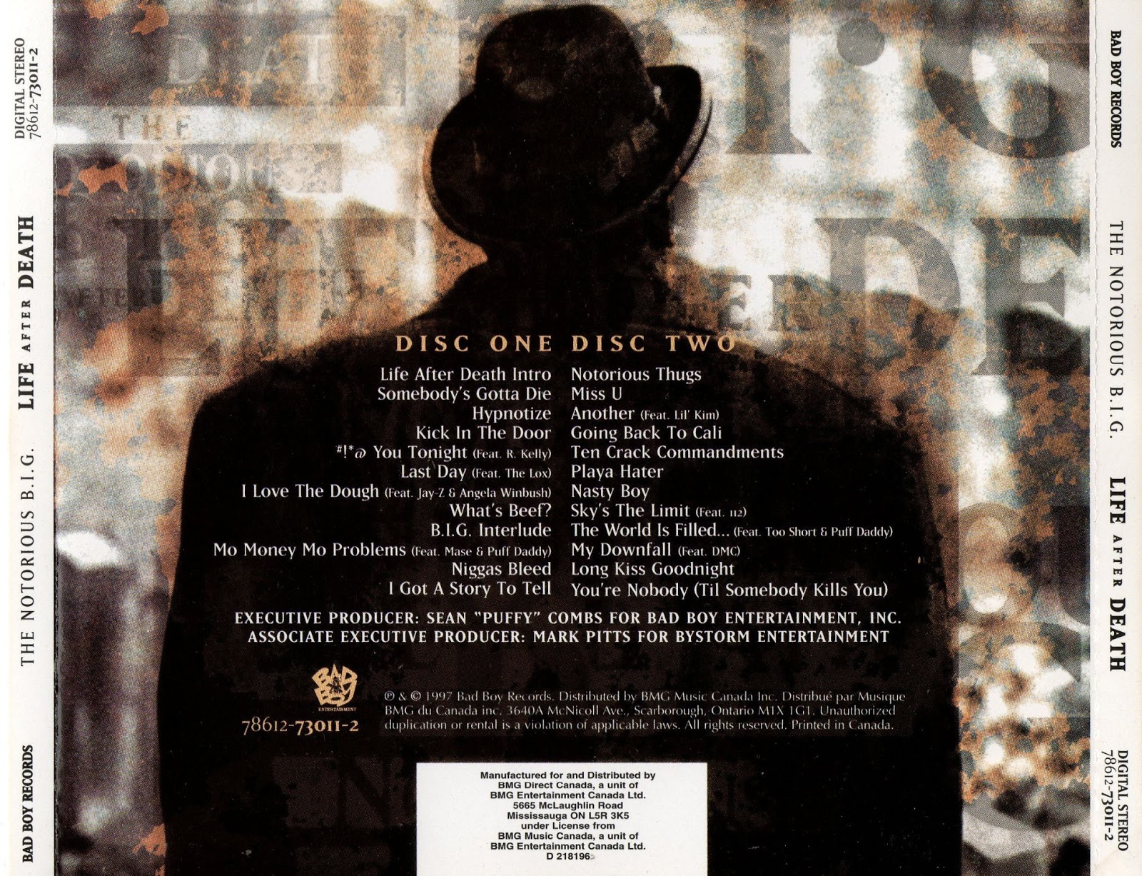
This is the back cover. The layout of this is quite messy
(in terms of the positioning of the track listing), on each side of the back
cover are the side panes, the background shows what seems to be a fly tipped
location with a strong sepia effect on it. The whole idea of the track listing
being laid out like it is could mirror the image and the messiness of it. The
fact that the image is sepia could also represent the idea that this album is
quite nostalgic and close to home to the artist.

This is the disc for Nas’ Illmatic. The CD looks very
similar to a vinyl due to the way the text is laid out and also because of the
lack of logo or imagery, this may have been incorporated to again reinforce the
whole nostalgic feel to the album. In terms of colour scheme, the CD is quite
plain but effective with a striking use of the colour red. This colour may have
many reasons; for example Nas was from New York (east side) where the infamous
‘Bloods’ gang reside from he may have
used this to represent them it could also be a reference to the different
meanings of the colour red (passion, love danger) all feelings which may have
some sort of meaning and relation to him.

This is the inlay; unlike the average album this inlay
contains no text. The image of this inlay is a reversed image of the front
cover this gives the illusion that the child is constantly looking at the
viewer.

This is The Notorious B.I.G’s 2nd
album ‘Life After Death’. As is shown by the image and text, the album is based
heavily around death. The main image shows a picture of Biggie leaning on a
hearse. This conveys that the theme of his album is about death (as the mise en
scene is themed heavily around a funeral). The shot type is a wide shot which
has been shot in black and white; this gives the image a deathly and depressing
feel. In terms of body language Biggie is shown to be slouching as if the idea
of death has become so normal to him that he no longer cares. The title of the
album ‘Life After Death’ is written in a handwritten font (similar to what is
written on a death certificate) and in a fiery colour which could be an
allusion to hell and also a cremation ceremony (the former being a theme that
Biggie explored heavily on his last song before this album). The font used for
his name is very funeral text looking in a yellow/gold colour; again this corresponds
with the whole death/funeral theme.


This is the back cover for Dr Dre’s album ‘The Chronic’. The first thing that strikes the viewer is the inclusion of a cannabis leaf at the top of the image. This image relates to the title ‘The Chronic’ this is a type of weed which Dr Dre most likely would’ve been consuming along with his audience around the time of this albums release. It could also be an allusion to the controversial idea of how the drug helps ease someone going through an illness which is also known as a chronic. The main text body for the back cover is the tracklisting which is typed out in a quite a funky font. This could maybe be a tribute to Dre’s old group he was in as a junior in which the genre they performed was funky/electro. The back cover keeps up with the house style as another image of it is of a border which surrounds the tracklisting. It is quite an old fashioned type of border and although at the time of its release would’ve been evidently new; Dre may quite vaingloriously have meant it to be an album that would be popular for years and therefore old in that sense.

This is the disc belonging to the
album ‘The Chronic’, noted for its simplicity it merely contains an image of a cannabis
leaf on a black background. This could have been a way of Dre saying that smoking
weed was the simple answer to life.

This image is the inlay of Dre’s album ‘the Chronic’. This image differs from the others as it shows a full body shot Dre. This could be to show off the sort of things Dre can afford to buy. For example he is wearing new trainers, expensive clothing, ear piercing, sitting on an expensive car. The way in which he is sitting on the car along with his facial expression shows the audience that he is quite used to and almost blasé towards his apparent fortune. The image is quite dark aswell however there is light towards the right of the image which could be a reference to the idea that he came from a dark and place but is going towards a brighter place which in turn could be a metaphor for his lifestyle. The borderline which is present in the front and back covers is also present in this image in a way of keeping up with the house style.

This is the advert for Jay-Z’s ‘The blueprint 2’. This image
was extracted from a newspaper. The main image used in this advert is a black
and white close up of the artist posing with a hand sign. The image being black
and white was probably used to go with the theme of the album’s name ‘The
blueprint’ as its colour scheme matches that of actual blueprint documents
(where it is usually just colourless with the blue outlines. This gives the
image an almost sci-fi look and is quite interesting to note as this goes
against the usual conventions of a hip hop album where they would probably look
down on such ideas. This however could be an indication of Jay-Z’s position in
the rap game and how he can’t be critiqued for the use of this idea by other
rappers who normally would on any other rapper of lower status. The use of the
close up shot shows us a facial expression of Jay-Z as being quite
concentrated, he seems to be frowning and it seems as if he thinking about
something else however his hand action signals to the viewer that he knows what
he is doing and that ‘everything is cool’. The main text bodies used are his
logo which has a different font type and which is right at the top in blue.
This is interesting as this is the only feature of the advert which is that
colour. The connotations that go with the positioning and colour of his logo
could go along with the idea of which was explored earlier about his position
in the rap game and music industry as a whole. The two cover lines below that
are in grey and also in a different font. The idea of the number 2’s position
next to the word ‘Blueprint’ links in with the whole theme as it is placed in a
mathematical manner and again maths is used a lot in genuine blue prints. The
next 4 cover lines after that are in a more block type font in bold. This is
probably due to information purposes as it would be highly important for the
reader to know when, what and how they can buy the album.

This is Jay-Z’s advert for his album ‘The Blueprint 3’. This
is the successor to his previous album ‘The Blueprint 2’ in which was explored
above. The concept for this image is completely different to its predecessor.
One of the most notable things are that the main image is of musical
instruments and not that of the actual artist himself. It is rather interesting
as to how the image was created as it seems that all the instruments have been
painted white (and left black on certain areas) again making a reference to the
literal concept of a blueprint. The idea that all the instrumentals have been
put together could connote the idea that the album has an array of sounds and
sub genres and therefore could symbolize the idea of Jay-Z being a ‘master’ of
music. The red stripes are a colour of red which could be an allusion to the
loyalty of his birthplace associations (Bloods) but more simply themes that go
with that colour; passion, love etc. The text used in this image is quite
modern and classy. This may have been used as a way of symbolizing the artists
sound from the album. The positioning of the text bodies in relation to the
whole image are that it makes for a more conventional and professional looking
final outcome, it also allows for the information to be easily interpreted. The
inclusion of the single at the bottom could help with audiences choice in
purchasing the advertised product due to the fact that the song advertised
would presumably be very popular this also links in with the image explored
above, as that includes the same idea.

This is UK artist; Wretch 32’s album advert. Straight away
the genre is made clear via a number of ways these include: the use of graffiti
styled paint brush imagery around and on the artist, the use of a block of
flats in the background, the use of a graffiti styled font and also the use of
black. The genre this was meant to reflect was UK Rap, the designs mentioned
above all have some sort of connection to the type of life that is involved in
the UK Rap scene. The use of including this into the image makes for a much
more authentic and realistic expectation of what the listener will hear thus
creating a higher likelihood of him/her purchasing the album. To go into more detail
about the main image it shows a long/mid shot of the artist peering towards his
right side, the use of such a shot type could’ve been used to convey the
artists body language to the surrounding scenery. For example, in this case it
shows him to be quite pre occupied with what he is seeing and It almost looks
like his is spectating something of which he is focusing on quite a lot, however
at the same time his body language shows that he is not likely to go towards
whatever he is looking at and therefore ultimately could be connotation of how
he is close to being drawn into the negative aspects of urban life but is able
to not be overcome by the whole distraction. In his left hand is a necklace
with a cross, this could also be another way of symbolising the sort of content
on his album and also to show that through all of the negative aspects of his
life, he has God on his side. At the
bottom of the image is the commercial side of his album, showing what the album
looks like, how it can be purchased, where it can be purchased etc. the
designer used the official logos of each shop as a way of creating a sense of familiarity
and also authenticity as money and similar domains are a highly important but
equally delicate part of luring a customer to buy a product or not.