Research and Planning
Wednesday, 27 March 2013
Friday, 15 March 2013
Wednesday, 20 February 2013
CD Designs
For this cover, we simply wanted to see what a prism effect would look like on a picture of a derelict area. This was to match the theme of the video and also the house style. The font used was 'Cooper STD' which was used due to its retro style.
This cover was designed with the intention of replicating the 'Dr Dre - The Chronic' album art. The cartoon style image of our artist was inspired by a cover from Chicago based rapper 'Chief Keef' (shown below) for me this gave the image a different style to how the other covers look. The font's placing was curved to again replicate Dr Dre's album layout.

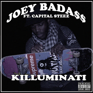
This image was created with the same layout as the above cover, only this time the cartoon image was replaced with an image of the artist holding a skateboard. The reason why this image was used was because a lot of good photography shots were not being used and by adding that to the text in my opinion gave the cover an air of professionalism.
This image was used because of the pose and they mise en scene of the image. It showed the artist in what appears to be a wall (representing urban culture) and also shows his attire which again represents the urban culture. I also used the image from inspiration off of Los Angeles based clique 'Odd Future' and one of their CD covers. As they tend to use images that are not of a serious nature (which goes against the convetions of your average rap album.

This cover was used with the image of the artist sitting on a curb with his skateboard. The reason why this was chosen was because of the positioning of the shot and what it contained (in regards to where the skateboard and the artist was sitting). Although it doesn't show him in the centre of the cover, it still looks rather professional and also the fact that the cover is dark shows brings about a feeling of mysteriousness.
This cover was designed with the intention of replicating the 'Dr Dre - The Chronic' album art. The cartoon style image of our artist was inspired by a cover from Chicago based rapper 'Chief Keef' (shown below) for me this gave the image a different style to how the other covers look. The font's placing was curved to again replicate Dr Dre's album layout.

This image was created with the same layout as the above cover, only this time the cartoon image was replaced with an image of the artist holding a skateboard. The reason why this image was used was because a lot of good photography shots were not being used and by adding that to the text in my opinion gave the cover an air of professionalism.
This image was used because of the pose and they mise en scene of the image. It showed the artist in what appears to be a wall (representing urban culture) and also shows his attire which again represents the urban culture. I also used the image from inspiration off of Los Angeles based clique 'Odd Future' and one of their CD covers. As they tend to use images that are not of a serious nature (which goes against the convetions of your average rap album.

This cover was used with the image of the artist sitting on a curb with his skateboard. The reason why this was chosen was because of the positioning of the shot and what it contained (in regards to where the skateboard and the artist was sitting). Although it doesn't show him in the centre of the cover, it still looks rather professional and also the fact that the cover is dark shows brings about a feeling of mysteriousness.
Sunday, 10 February 2013
Image Designs
The image above was created with the idea of using the TV static effect, we thought that this would coincide with the effect we used in the music video.
Thursday, 24 January 2013
Logo Idea
Today i decided to try and create a logo for my artist as that had not been done yet, an idea i had was to create a logo with a bright light coming from behind it as i thought that would give the whole cover a striking look however after actually creating the logo i found out that it didn't look as good or effective as i envisioned
Subscribe to:
Comments (Atom)


